Which color creates a sense of calm in the home?
Inspiration
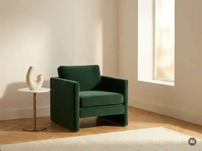
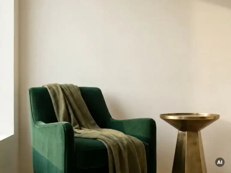
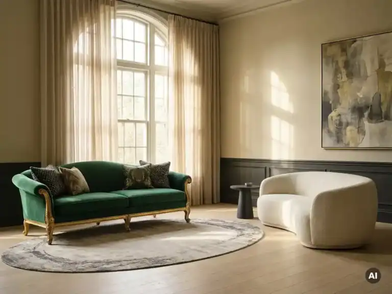
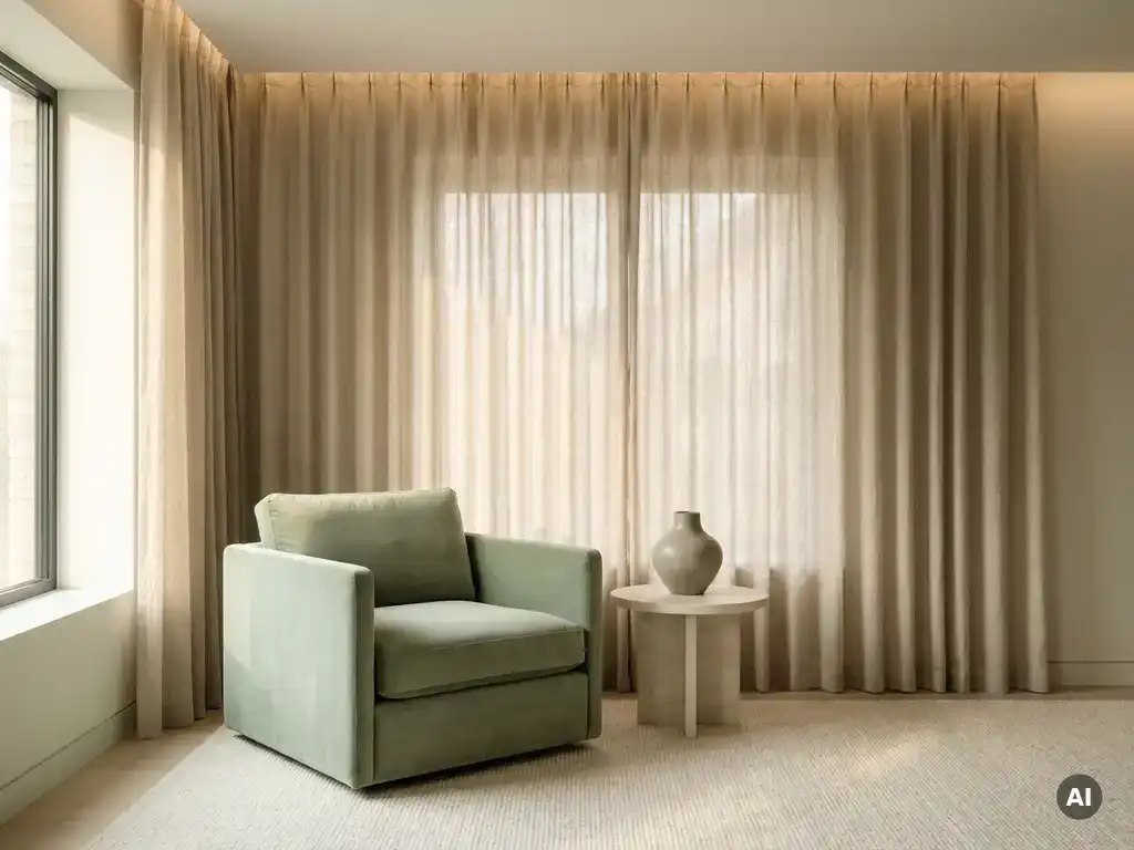
Soft shades such as “ sage ” green, soft blue, warm beige, and off-white bring the most tranquility to your home. These colors have a calming effect on the nervous system and create an atmosphere in which a space truly comes to life. In this article, we’ll take a closer look at the most frequently asked questions about soothing colors—from the bedroom to the living room—and show you how to combine them with an understanding of materials, form, and light to create a cohesive interior.
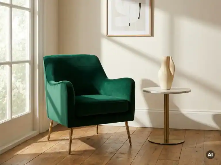
The colors most strongly associated with tranquility are soft green, light blue, warm beige, off-white, and light gray. These shades are low in saturation and light intensity, so they do not strain the eyes and evoke a sense of calm and spaciousness. They form the foundation of a soothing interior that feels both refined and inviting.
The most commonly used soothing colors in a premium interior:
What all these colors have in common is that they don't demand attention. They serve as a quiet backdrop against which materials, form, and light tell the story.
Some colors have a calming effect because they have low color saturation and provide little visual stimulation. Our brains process bright, high-contrast colors as stimuli that trigger alertness. Soft, muted tones have the opposite effect: they reduce mental activity and give the space an atmosphere of calm and balance.
Several factors determine the calming effect of color in an interior:
Soothing colors in interior design work because they limit the flow of visual information, thereby allowing the more subtle qualities of a space—texture, light, and proportions—to shine through.
For the bedroom, soft shades of blue, sage green, and warm neutral tones such as beige and cream are the most sophisticated choices. Calm colors in the bedroom promote sleep and create an environment that prepares the body and mind for rest. Blue ranks highest in this regard: it lowers the heart rate and evokes a sense of calm similar to the stillness just before falling asleep.
Design Principles for a Restful Bedroom:
Warm, neutral tones such as sand and off-white work particularly well if the bedroom also serves as a relaxation space during the day. They feel inviting and allow furniture made of natural-colored wood or bouclé to really shine.
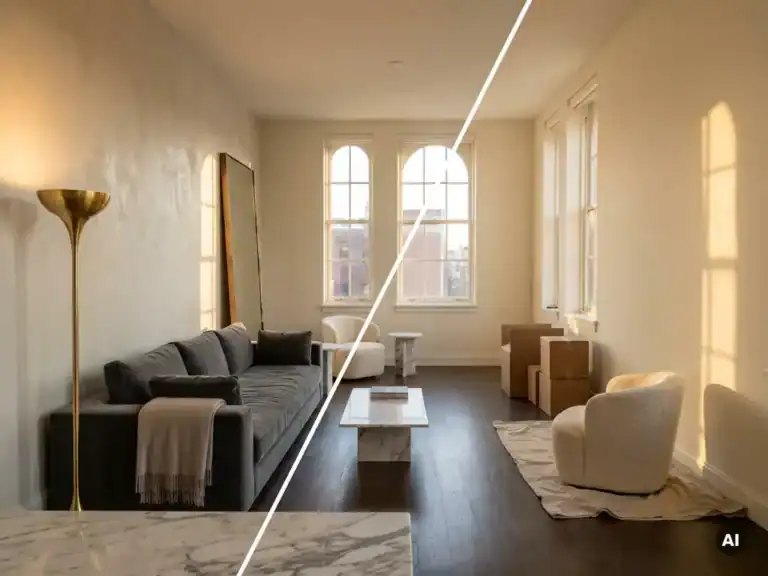
For the living room, warm neutral tones, muted greens, and soft grays are the most soothing choices. Soothing colors for the living room should also be inviting, since the living room is a lively, social space. That makes warm beige, taupe , and soft olive green excellent starting points: they create a sense of calm without making the space feel cold or distant.
The living room calls for a slightly different approach than the bedroom:
A complete collection of furniture and accessories in muted earth tones helps you seamlessly extend the chosen wall color throughout the rest of the interior.
In a soothing interior, avoid bright, highly saturated colors such as signal red, bright orange, vivid yellow, and neon colors. These shades stimulate the brain and increase alertness—the opposite of what a relaxing interior aims to achieve. Highly contrasting color combinations also create visual restlessness and distract attention from the qualities of materials and form.
Colors and combinations that disrupt the tranquility of an interior:
This does not mean that these colors are completely ignored. As accents—in a Cushion, a decorative object, or a detail in the lighting—they can actually create an interesting contrast that adds character to the space without disrupting its tranquility.
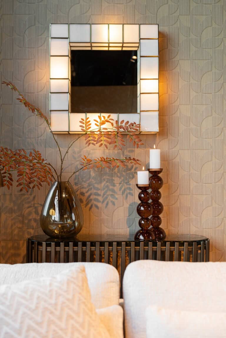
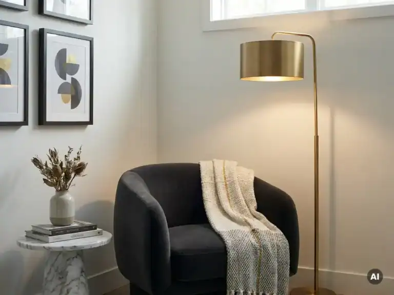
Soothing colors are best paired with furniture made of natural materials and in muted tones that complement the wall color without competing with it. Wood, linen, bouclé, and travertine in beige, warm gray, or soft brown enhance the atmosphere of a soothing interior while adding a tactile richness that refines a space.
Here's how to put this into practice:
The balance between color, material, and form is what distinguishes an interior that truly feels soothing from one that simply looks neutral.
A soothing color palette is the starting point. The real challenge lies in finding furniture and accessories that enhance that sense of calm—in terms of material, form, and finish. The collections at Richmond Interiors are curated with a focus on precisely those elements—color, texture, proportions, and atmosphere—so that an interior speaks as a whole rather than as the sum of its individual parts.
What the Richmond collections offer for a soothing interior:
Richmond Interiors ’s collections are available exclusively through select resellers. Find a retailer near you to experience the materials and finishes in person, or visit our “ Experience Center ” in Heerhugowaard. Do you have any questions? Feel free to contact us, and we’ll be happy to assist you.