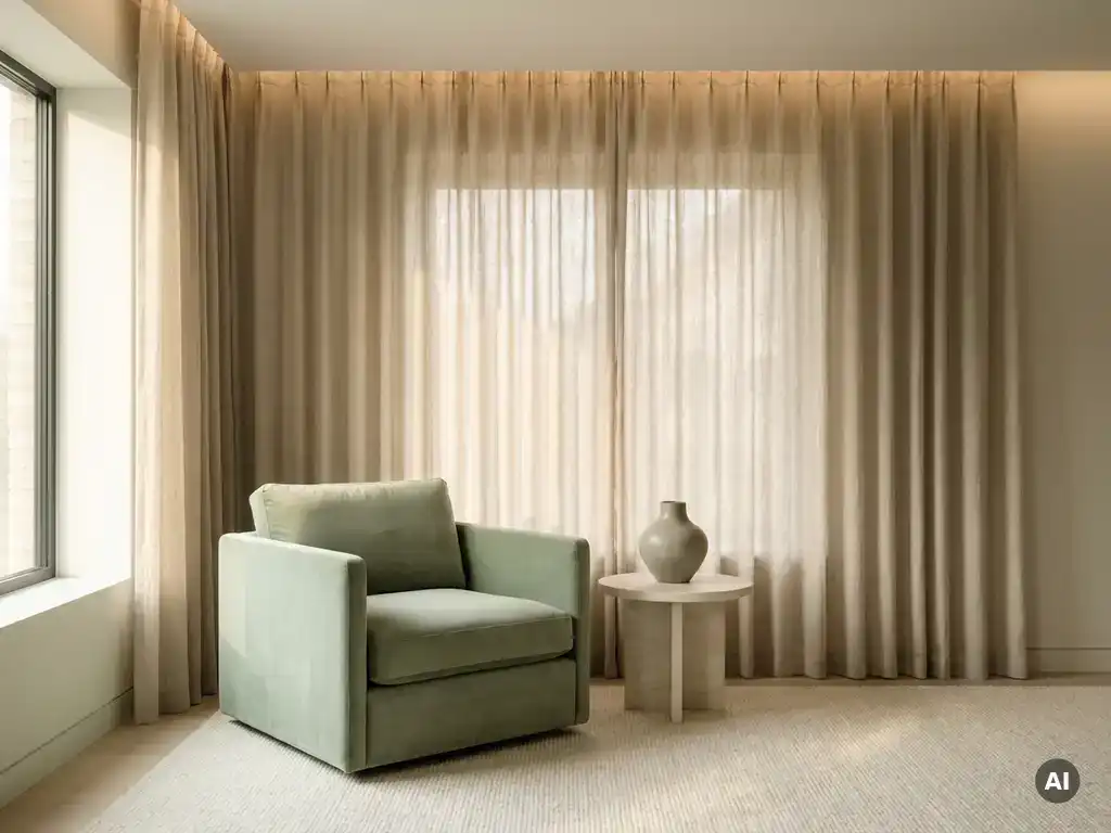
Which color creates a sense of calm in the home?
Inspiration
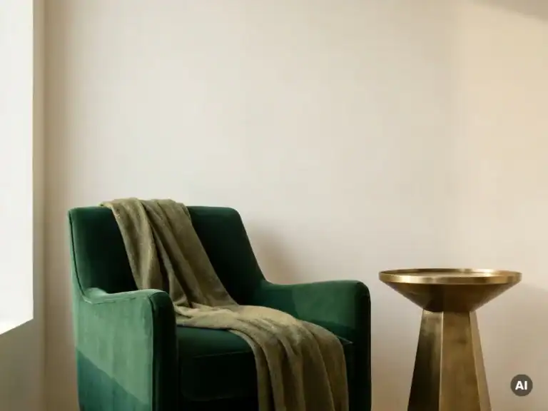
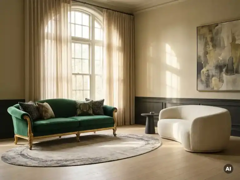
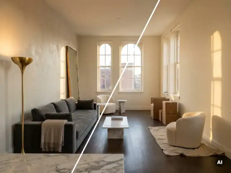
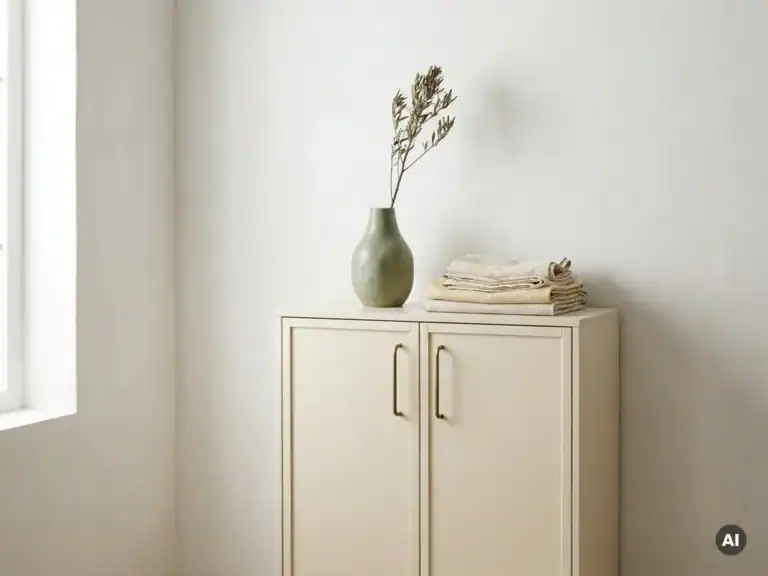
Soft shades such as “ sage ” green, soft blue, warm beige, and off-white bring the most tranquility to your home. These colors have a calming effect on the nervous system and create an atmosphere in which a space truly comes to life. In this article, we’ll take a closer look at the most frequently asked questions about soothing colors—from the bedroom to the living room—and show you how to combine them with an understanding of materials, form, and light to create a cohesive interior.
The colors most strongly associated with tranquility are soft green, light blue, warm beige, off-white, and light gray. These shades are low in saturation and light intensity, so they do not strain the eyes and evoke a sense of calm and spaciousness. They form the foundation of a soothing interior that feels both refined and inviting.
The most commonly used soothing colors in a premium interior:
What all these colors have in common is that they don't demand attention. They serve as a quiet backdrop against which materials, form, and light tell the story.
Some colors have a calming effect because they have low color saturation and provide little visual stimulation. Our brains process bright, high-contrast colors as stimuli that trigger alertness. Soft, muted tones have the opposite effect: they reduce mental activity and give the space an atmosphere of calm and balance.
Several factors determine the calming effect of color in an interior:
Soothing colors in interior design work because they limit the flow of visual information, thereby allowing the more subtle qualities of a space—texture, light, and proportions—to shine through.
For the bedroom, soft shades of blue, sage green, and warm neutral tones such as beige and cream are the most sophisticated choices. Calm colors in the bedroom promote sleep and create an environment that prepares the body and mind for rest. Blue ranks highest in this regard: it lowers the heart rate and evokes a sense of calm similar to the stillness just before falling asleep.
Design Principles for a Restful Bedroom:
Warm, neutral tones such as sand and off-white work particularly well if the bedroom also serves as a relaxation space during the day. They feel inviting and allow furniture made of natural-colored wood or bouclé to really shine.
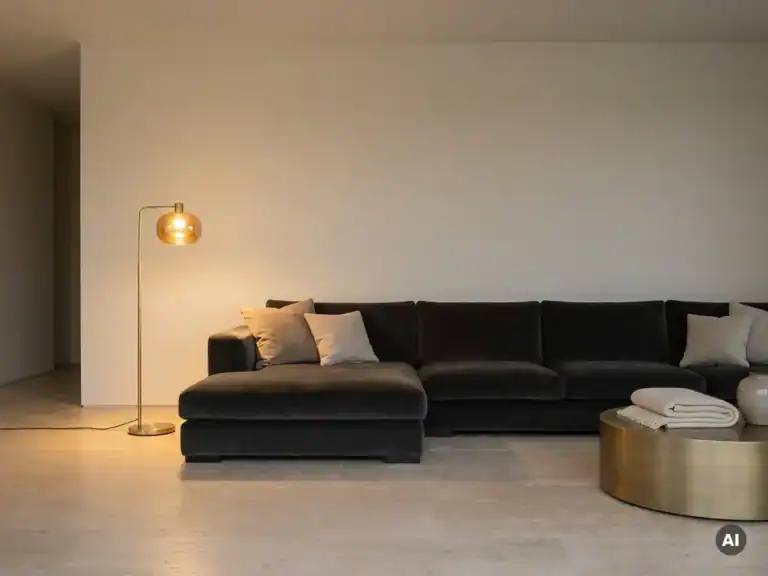
For the living room, warm neutral tones, muted greens, and soft grays are the most soothing choices. Soothing colors for the living room should also be inviting, since the living room is a lively, social space. That makes warm beige, taupe , and soft olive green excellent starting points: they create a sense of calm without making the space feel cold or distant.
The living room calls for a slightly different approach than the bedroom:
A complete collection of furniture and accessories in muted earth tones helps you seamlessly extend the chosen wall color throughout the rest of the interior.
In a soothing interior, avoid bright, highly saturated colors such as signal red, bright orange, vivid yellow, and neon colors. These shades stimulate the brain and increase alertness—the opposite of what a relaxing interior aims to achieve. Highly contrasting color combinations also create visual restlessness and distract attention from the qualities of materials and form.
Colors and combinations that disrupt the tranquility of an interior:
This does not mean that these colors are completely ignored. As accents—in a Cushion, a decorative object, or a detail in the lighting—they can actually create an interesting contrast that adds character to the space without disrupting its tranquility.
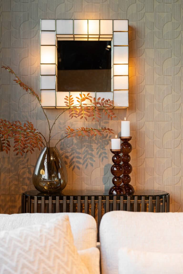
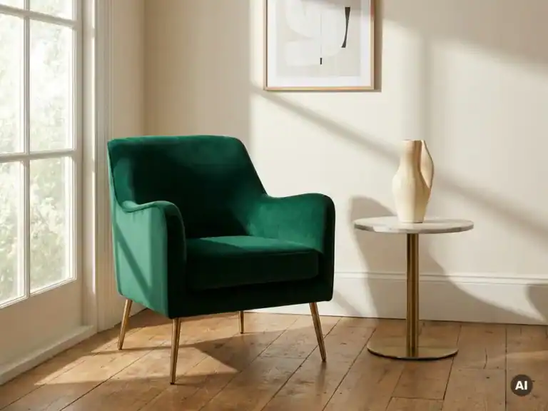
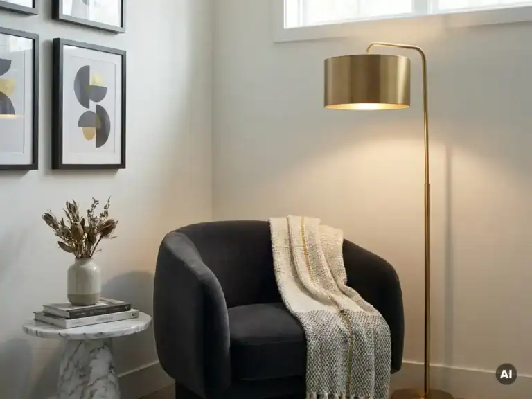
Soothing colors are best paired with furniture made of natural materials and in muted tones that complement the wall color without competing with it. Wood, linen, bouclé, and travertine in beige, warm gray, or soft brown enhance the atmosphere of a soothing interior while adding a tactile richness that refines a space.
Here's how to put this into practice:
The balance between color, material, and form is what distinguishes an interior that truly feels soothing from one that simply looks neutral.
A soothing color palette is the starting point. The real challenge lies in finding furniture and accessories that enhance that sense of calm—in terms of material, form, and finish. The collections at Richmond Interiors are curated with a focus on precisely those elements—color, texture, proportions, and atmosphere—so that an interior speaks as a whole rather than as the sum of its individual parts.
What the Richmond collections offer for a soothing interior:
Richmond Interiors ’s collections are available exclusively through select resellers. Find a retailer near you to experience the materials and finishes in person, or visit our “ Experience Center ” in Heerhugowaard. Do you have any questions? Feel free to contact us, and we’ll be happy to assist you.
[seoaic_faq][{“id”:0,”title”:”Hoe weet ik of een rustgevende kleur ook echt werkt in mijn specifieke ruimte?”,”content”:”De beste manier om dit te testen is door grote verfstalen (minimaal A4-formaat) op de muur te plakken en deze op verschillende momenten van de dag te bekijken. Daglicht, kunstlicht en de oriëntatie van de ruimte hebben namelijk grote invloed op hoe een kleur overkomt. Een kleur die in de winkel of op een scherm rustig oogt, kan in een noordelijk gelegen kamer met weinig licht koud of grauw aanvoelen.”},{“id”:1,”title”:”Kan ik rustgevende kleuren ook gebruiken in een kleine ruimte zonder dat het benauwd wordt?”,”content”:”Absoluut. Kies in kleine ruimtes voor lichtere varianten binnen de rustgevende kleurenfamilie, zoals gebroken wit, lichtgrijs of een zachte blauwtint, en zorg voor voldoende licht. Vermijd donkere accentwanden in kleine kamers, en kies meubels in vergelijkbare tinten als de wand om de ruimte visueel groter te laten lijken. Het principe van weinig contrast tussen wand, vloer en meubels werkt juist in kleine ruimtes extra goed.”},{“id”:2,”title”:”Wat als mijn partner en ik het niet eens zijn over de kleurkeuze?”,”content”:”Zoek dan naar een neutrale basis die voor beiden werkt, zoals warm beige, taupe of lichtgrijs, en geef elk van jullie invloed op de accessoires en textiel. Op die manier is de rustgevende basis gedeeld, maar is er ruimte voor persoonlijke accenten via kussens, planten of decoratieve objecten. Een gedeelde kleurenfamilie met variatie in materialen en texturen is vaak een effectieve middenweg.”},{“id”:3,”title”:”Hoe voorkom ik dat mijn rustgevend interieur er saai of levenloos uitziet?”,”content”:”Voeg diepte en karakter toe via textuur in plaats van kleur: denk aan een bouclé bank, een geweven vloerkleed, linnen gordijnen of een marmerlook bijzettafel. Planten zijn ook een uitstekende manier om leven in een gedempte kleurenpalet te brengen zonder de rust te verstoren. Kleine gouden of messing accenten in verlichting of decoratie geven een rustgevend interieur net dat beetje warmte en karakter dat het onderscheidt van een klinische, kleurloze ruimte.”},{“id”:4,”title”:”Moet ik alle muren in dezelfde rustgevende kleur schilderen, of kan ik variëren?”,”content”:”Je hoeft zeker niet alle muren in dezelfde kleur te schilderen. Een populaire aanpak is om drie muren in een lichte neutrale tint te houden en één accentwand te schilderen in een iets diepere tint uit dezelfde kleurenfamilie, bijvoorbeeld een dieper sagegreen of een warmere beige. Dit creëert visuele diepte en interesse zonder de rust te doorbreken. Zorg er wel voor dat de kleuren dicht genoeg bij elkaar liggen, zodat het contrast subtiel blijft.”},{“id”:5,”title”:”Werken rustgevende kleuren ook goed in een werkkamer of thuiskantoor?”,”content”:”Ja, maar met een kleine nuance: voor een thuiskantoor zijn lichte groentinten zoals sage green of zachtgrijs bijzonder geschikt, omdat ze rust brengen zonder slaperigheid op te wekken. Vermijd te warme of te donkere tinten die de energie te veel wegnemen. Een goede balans is een rustige wandkleur gecombineerd met voldoende daglicht en een gestructureerde, opgeruimde inrichting.”},{“id”:6,”title”:”Hoe lang gaat een rustgevend kleurenpalet mee voordat het gedateerd raakt?”,”content”:”Rustgevende kleuren zoals sage green, warm beige, gebroken wit en taupe zijn tijdloze basiskleuren die al decennia populair zijn in interieurdesign en niet snel verouderen. In tegenstelling tot trendgevoelige felle kleuren blijven gedempte, aardse tinten relevant omdat ze aansluiten bij een universeel gevoel van comfort en kalmte. Door je meubels en accessoires te kiezen op kwaliteit en tijloosheid, in plaats van op de trend van het moment, bouw je een interieur dat jarenlang mooi en rustgevend blijft.”}][/seoaic_faq]